My Simplicity Focused Website Tech Stack
To build this website as well as the landing page for my book, I chose tools that would allow me to have a simple workflow.
Here is what I used:
Analytics
To track how many people visit my website, I use Fathom Analytics
Rather than using Google Analytics for free, I opted to pay $14/month for Fathom. It's a new and simple analytics tool that gives me quick access to all of the information I want up-front, without any BS or vanity metrics.
Fathom is also privacy focused and doesn't rely on cookies, therefore you don't need any annoying cookie pop-ups.
I get all of the analytics data I want, and I'm happy to support an indie analytics solution rather than a larger behemoth like Google. I have nothing personal against Google, but I feel good paying someone I can interact with on Twitter rather than sharing my data with a company I have no personal interaction with.
Fathom is inexpensive, good quality, and I can use my one account to track multiple websites. Simple and valuable, that's what I want to pay for. Plus, they have a great blog.
The link below gives you $10 off if you use it, as well as a small bonus to my account.
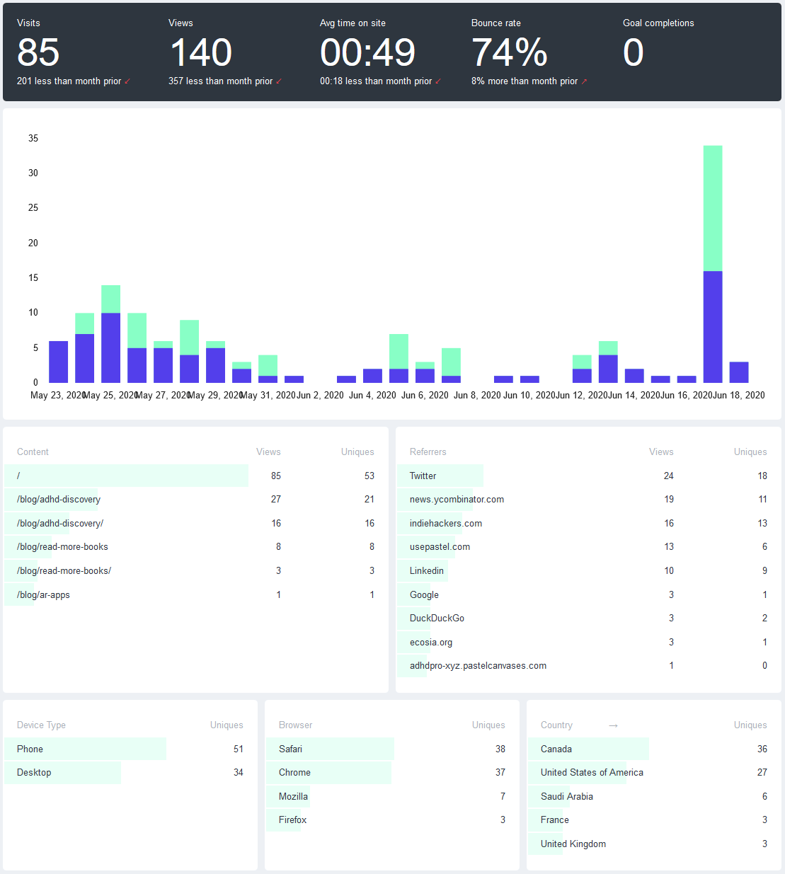
This is what the Fathom Analytics interface looks like:
Newsletter
I send out my newsletter every time I post something. To manage this, I use ConvertKit
Just like Fathom, there is nothing particularly complicated about ConvertKit. It's simple, gets the job done, and just works. ConvertKit also makes it very easy to serve sample chapters for my book to new sign-ups. Once users confirm their emails, they get sent to a URL or file upload of my choosing. Simple and easy.
I did end up using the (easy to use) API rather than the built-in forms because I wanted to make my sign-up form more dynamic with some Javascript, but that's not required.
The only drawback of ConvertKit is that I can't manage multiple email lists from one account. It's not a deal breaker, just a bit annoying. Not enough to make me quit.
It is possible to automatically send emails from ConvertKit via Netlify, but I did not set this up because I often update my posts a few times before I am ready to send emails about them.
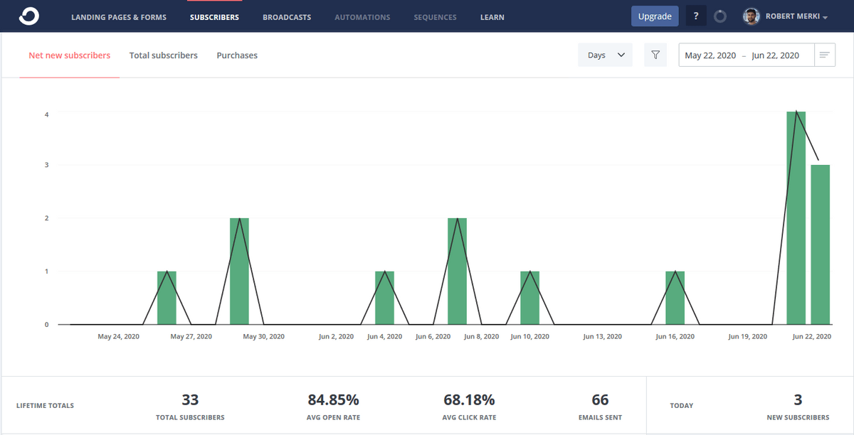
This is what the ConvertKit interface looks like:
Web Hosting
To host this website, I chose the kings of simplicity: Netlify
I am a super-fan of Netlify. If you have a static website, use Netlify.
Their interface is excellent and everything works perfectly. It's one of those apps that makes me mad because of how good it is.
Sign-up for free and point to your GitHub repository. Every time you push to master, it updates your website. That's it.
By the way, Netlify has made money from me indirectly by my strong recommendations to several businesses, who now happily pay for the immense value Netlify provides them. I sound like an advertisement, and perhaps I am. This is peak happy customer.
Note: I have heard very good things about Vercel, but I haven't tried them. This isn't a comparison, just my own good experience with Netlify!
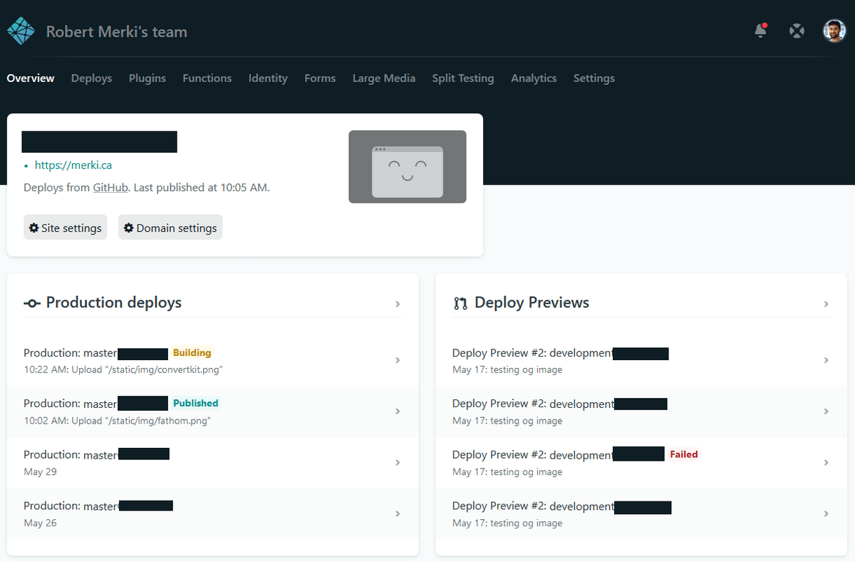
This is what the Netlify interface looks like (some fields hidden for privacy reasons):
Domain Name
To buy and manage domain names, I use Namecheap
Just like the rest of these services, they are simple and easy to use. Their support is also excellent. I had an issue with my domain name (which was NOT their fault) and it was resolved within 10 minutes via their support chat. And this was at 11pm PST. Couldn't be happier.
I did transfer the DNS management to Netlify, but that's just for simplicity sake since I tend to be on the Netlify dashboard more than the Namecheap dashboard. Namecheap made this very easy and fast.
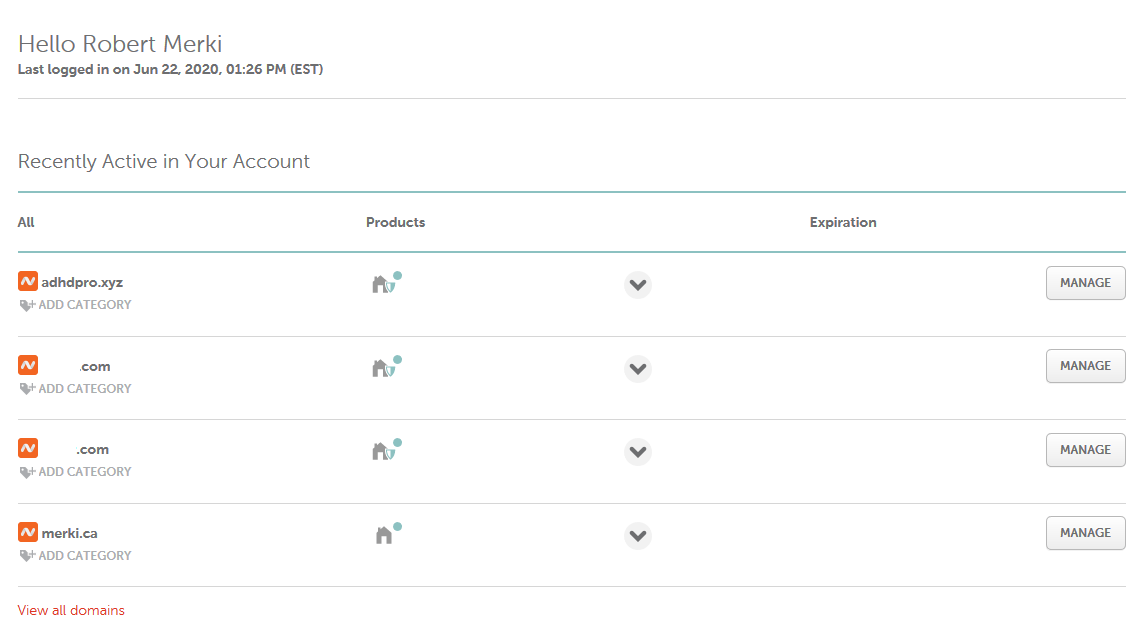
This is what the Namecheap interface looks like (some fields hidden for privacy reasons):
Email Forwarding
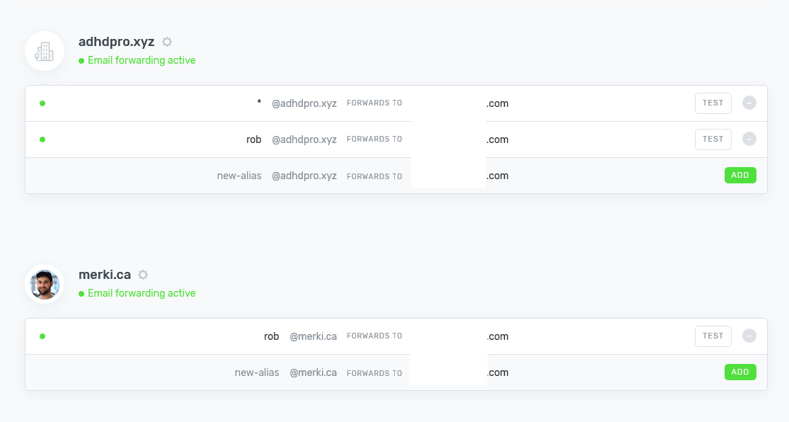
To manage email forwarding, I use ImproveMX
This lets me point multiple email addresses to my main email inbox, so I don't need to monitor multiple inboxes for multiple domain names.
Extremely simple and with a fantastic interface. Their support is fantastic as well.
This is what the ImproveMX interface looks like (my email addresses hidden for privacy reasons):
Website Generator
To generate a website for my posts I use GatsbyJS
Gatsby is a static site generator built on ReactJS. You create blog posts by creating new markdown files, which are then generated into a static HTML website. Gatsby is very simple, but you probably need to know how to use React in order to customize it to your liking.
There are alternative static site generators, but Gatsby seemed to have more plugins that I was able to find useful, and I have a strong grasp of React so it was easy for me to use.
Content Workflow
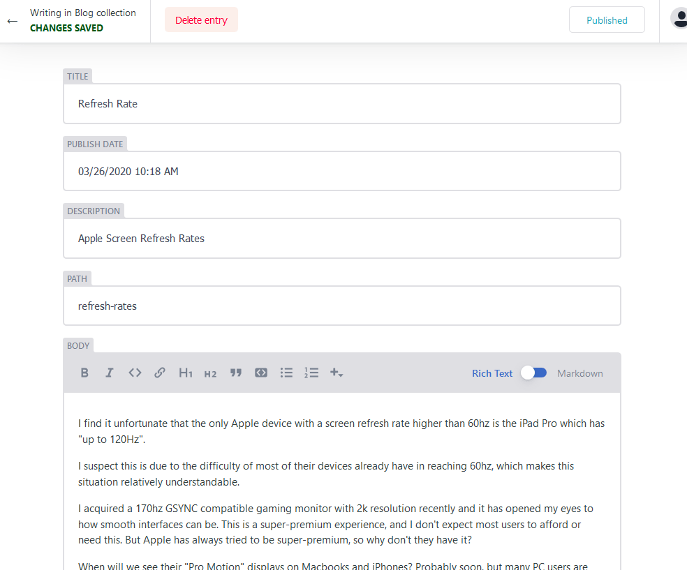
To post new content, I use NetlifyCMS
I connected the NetlifyCMS workflow to my Gatsby configuration using this plugin. This means I can go to a special link on my blog, sign-in with Netlify, and write new posts right from a web interface. When I press "save" it connects to Github and pushes the changes, which prompts a build on the main Netlify interface. Very simple and clean.
This is what NetlifyCMS interface looks like:
Twitter & Open Graph Preview Cards
To generate Open Graph preview images for my Gatsby blog, I use gatsby-plugin-printer.
This runs a Chromium instance during build time which takes a screenshot of a hidden webpage, which then includes content from the actual blog post. I only included the post title on my own cards, but you can add whatever you want.
This "screenshot" is saved, and set as the og:imageproperty in the <head> of each page.
This workflow lets me automatically generate Open Graph images based on my blog posts. These are the images you see in "preview cards" on Twitter and other places you may post links to. I used this tutorial and customized the output to my preferred design.
The setup was not simple, however the end result is a straightforward process that saves me a lot of manual time when posting new blog posts.
This is what that the end result looks like on Twitter (the card you see is automatically generated):

Design & CSS Framework
To design and style my website, I use TailwindCSS
I did not create any mockups, I simply started building using Tailwind CSS components and kept working until I was satisfied with the results.
Tailwind is simple because I don't have to write any CSS. There are also hidden benefits from using Tailwind. The biggest benefit is that the creators are amazing designers, and they baked in visually appealing sizing/spacing/padding/margins so it's difficult to make something ugly.
I love Tailwind and recommended it to anyone starting a new web project.
The only customization I made were to fonts, colors, and enabling transition states. I chose my own primary blue color and modified the Tailwind configuration file.
Here is my entire Tailwind config file:
module.exports = {
  variants: {
    transitionDuration: ['responsive', 'hover', 'focus'],
  },
  theme: {
    fontFamily: {
      'sans': 'Mukta, Open Sans, Roboto, Arial, Helvetica Neue, Helvetica, sans-serif',
    },
    extend: {
      colors: {
        blue: {
          "100": "rgb(237,243,255)",
          "200": "rgb(165,186,236)",
          "300": "rgb(101,136,217)",
          "400": "rgb(46,92,198)",
          "500": "rgb(0,54,179)",
          "600": "rgb(2,48,153)",
          "700": "rgb(3,41,128)",
          "800": "rgb(4,33,102)",
          "900": "rgb(4,26,77)",
        }
      }
    }
  }
}
Version Control
For version control, I use GitHub.
It's simple. I know how to use it. It works.